Branding & Identity
Case Study | MFA Graduate Thesis Project
Academy of Art University Graduate School of Web Design & New Media
Week 11
This week I accomplished A LOT!
Here are the highlights:
- Continued learning Adode XD to create prototypes.
- Continued work on creating and refining my Proof of Concept for my 3 main task flows.
- Conducted 4 In-person Paper Prototype Tests.
- Conducted 3 Online Paper Prototype Tests.
- Implemented changes from prototype test results & feedback.
- Made several revisions to my project slide show presentation.
- Re-ordered my project slides.
- Continued to deepen my research on AR apps.
- Participated in my classmates Paper Prototype Tests and provided feedback.
I examined my Project's branding and identity and started focusing on the overall look and feel of my Project. I thought about how I will present my Project to the world.
The most important element in a company's branding is the logo, which expresses the identity of the company. The logo is a visual representation of the company's trademark or brand. The logo is used throughout the structure and workings of that company.
Visual Style Guide and Content Fidelity
A visual style guide consists of:
- brand usage (logo/logo type)
- color palettes
- typography
- UI elements
Project Branding and Identity
Branding is the core of my Project's DNA and reflects its values. The term "corporate identity" is often referred to as the "visual persona" of a company.
You must ensure that you have a cohesive visual identity that promotes your brand and makes you distinguishable to your audience. The visual identity becomes the branding of a company, and it is used to separate your company from any competition.
A logo is a graphic representation of an entity.
A logo can also be referred to as:
- brand
- logo type
- wordmark
- hallmark
- trademark
Logos typically consist of a company name in conjunction with a graphic element, which convey the philosophy or goals of the company. A tagline can be combined with a logo to further characterize a company.
Understanding a company and its objectives is important in the design of its logo. The originality of a logo is crucial in defining a company and helps it to stand out from other companies in the marketplace.
The logo for my Project will deal with many of the same issues that a company deals with when designing its identity.
It should be the following:
- clear
- appropriate
- versatile
- memorable
Here is my logo and visual style guide:
![]()
Adobe XD
I am absolutely loving Adobe XD to create user experiences! I watched several tutorials to learn about the program, its features, and workflow. It will defiantly be my go-to for creating wire-frames and mock-ups!
This is an example of one of my wire-frames made in Adobe XD:

I have not had a chance to turn my prototype into a clickable file that I can send out for user testing. That is what I plan to do next and I am so excited to play around with that feature!
Proof of Concept
This week I continued to work on this. I designed and re-designed wire-frames and created a presentation that included user touch points, audio scripts, screen names, walk-through numbers, and text descriptions to show key elements/interactions on the screen.

I felt I needed to take more time to research current AR apps on the market and how they approached the user interface. It was evident that AR is still very new since there aren't many apps on the market yet compared to other apps that have saturated markets. This is a good and bad thing. It’s good in the sense that I get to be part of pioneer the technology’s application development. It's bad because there aren't many examples to look to for reference.
However, I did find an AR project app that I really liked! This led me to do more research on the project itself, which led me to do more research on the projects' artist, Larim Ben Khelifa, and the production teams that helped produced it. AMAZING!
The project is called "The Enemy." I love the cinematic approach that was used to create the AR app.
It is a source of inspiration for AR my design.

The Enemy was created by several production teams and had extensive financial backing. Which lead me to start thinking about the production scope and costs for my project- which is good!
More information about the project can be found here: http://theenemyishere.org
The Enemy app can be downloaded on the app store. You should give it a try! It's pretty cool!
Main Task Flows
I completed the Proof of Concept for my 3 main task flows.
I created all the wireframe mockups in Adobe XD, then imported them into Adobe InDesign for presentation.
Paper Prototype Testing
I created paper prototypes for each task flow sequence, a moderator task sheet for each, and 3 A/B Tests. I conducted 4 in-person tests, each taking an hour to complete.
My participants provided great feedback that helped me to improve my designs and flows. I video recorded each test session so that I can review the process and make improvements.

I also received valuable feedback from three of my classmates who completed the testing as well.
I implemented several changes and revisions with the feedback and results from all of the test. The process is definitely very valuable.

Project Slideshow Presentation Revision & Re-ordering
I created Master Slides for all of the slides. I updated the Table of Contents slide and added it back into the presentation.
I clarified the Abstract slide and added these new slides:
- Proof of Concept slide
- Paper Prototype Test slide (since this was not in my last assignment)
- The Awakened App slide
I also removed the card sort slides and the storyboard slide.
I found a great app for making my A/B Test Results charts.
It's called Visme. Check it out here: https://www.visme.co/chart-maker
![]()
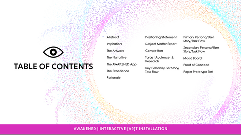
My new slide line-up looks like this:
- Abstract
- Inspiration
- The Artwork
- The Narrative
- The AWAKENED App
- The Experience
- Rationale
- Positioning Statement
- Subject Matter Expert
- Competitors
- Target Audience & Research
- Key Persona/User Story/Task Flow
- Primary Persona/User Story/Task Flow
- Secondary Persona/User Story/Task Flow
- Mood Board
- Proof of Concept
- Paper Prototype Test
All in all it was a SUPER BUSY week, with many late nights- if not all were late nights! But well worth the work and lack of sleep. I feel like I am getting to know my project better and I am still excited about it!
Coming-Up Next...
Next week, I will be learning about the importance of documentation and presentation techniques:
- Define what a portfolio is
- Examine tips to present a portfolio
- Evaluate your selection of portfolio work
- Identify portfolio development
- Observe portfolio attributes
This blog will serve as a place to create my case study. I invite you to follow along with me as I journey through this process.
Thank you for reading and for your interest.
Julie A. Davis